A picture is worth a thousand clicks.
Forgive the awful cliché, but it perfectly captures the importance of using images with calls-to-action on your website.
Graphics and images help focus the visitor’s attention, and if you do it right, their eyes will go right to your CTA, the place where a stranger can become your brand’s newest friend.If you are a busy marketer who has urgent graphic design needs for your blog (and has no clue how to use Photoshop) – this article is for you. But before we dig in, a little clarification first…
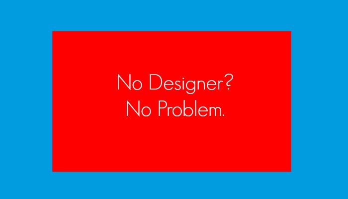
Always Use a Graphic Designer! (Except When You Can't)

This tutorial is not a permanent solution for your design needs.
If you want your business to look professional, you need a skilled graphic designer. If you can’t afford to hire one full-time, there are thousands of talented freelancers that will help you get by until you can. We've worked with some of the best in the business. If you're looking for fresh talent, New England Standard is a great way to go.

Sometimes you might find yourself in a pinch, though. Workloads fill up and you might have to design something on short notice, like a CTA for a blog post. Going rogue is not a great idea if you’re a large enterprise with several thousand monthly visitors, but if you are still growing your audience - speed is more important than perfection. If you’ve got a good eye for design, but no skills with Photoshop, this post is for you.
1. Create An Account With Pic Monkey
PicMonkey is a free online image editing website that offers premium features for $3.99 a month when you pre-pay annually. It allows you to edit images, create graphics, and design collages. Pretty cool stuff, and simple to use.

Can you get by with the free version? Yeah, but there are some good reasons to buck up and pay for the premium version, which we will get into in a bit.
2. Import Your Background Image, Or Create A New One
You have a few options when it comes to creating a background for your CTA. You can either import an image and edit it, or start with a blank canvas and use the textures and effects on the menu.
Creating a background can be tricky. Avoid images that are too light in color (unless you plan to modify them) or too busy in texture. The purpose of the background is to make your text stand out, and a complex design will compete with your message rather than enhance it.
Let’s create a CTA using this white 3D image.

From the Pic Monkey homes screen, go to “Edit” on the main menu and select the image you want from wherever the file is stored.
3. Crop The Image To The Correct Size
First, you will want to crop your image. From the sidebar menu, click on the icon at the top for “Basic Edits.” This will bring up a submenu of boilerplate adjustments you can make to your image. Select “Crop” and you will get a dropdown that shows you that actual dimensions of your image. You can grab the corners of the crop tool on the image itself, or you can enter the values for width and height under “Actual Size.”

Remember it’s always better to design a large image you can scale down, rather than vice versa. Increasing the size of a smaller image will result in resolution loss.
In this example, I changed the dimensions to 1000x300, then clicked “Apply.”
4. Add Color Treatment And Text
Now we have a nice rectangular texture to work with. Before adding color, it’s a good idea to look at the page or post the CTA is going on. Remember, you want the graphic to grab the reader’s attention, so choosing a color that’s different from the other design elements is always a good idea.
Some people get better results by clashing a little with the page design. Others are more concerned with keeping the colors consistent with the brand. If you are one of the latter, you can use a site like Color Combos to get the hex codes for colors on your website. Just enter the URL, click the magnifying glass, and you will get results that look something like this:

One of the easiest ways to superimpose color on an imported image in Pic Monkey is create a gradient color.
Go back to PM and select the “Effects” wand. Scroll down to the “Ombre” effect, click on the field on the right and paste the hex code. The result will be a gradient of your chosen color and the natural color of the image.

You can shift the direction of the gradient from top-to-bottom to left-to-right (or vice versa). Do this by grabbing the “Direction” slider and moving it until you have a position you like.

If you want, you can choose a darker color for the other half of the gradient by clicking on the field on the left and choosing a new color. When everything is how you want it, click “Apply.”

Now you are ready to add some awesome call-to-action text! Click on the “Tt” icon for text, and select the font you want (you can add new fonts by importing them into your computer. Pic Monkey allows you to choose from two font directories – theirs and yours.).
When the text editor pops up, you will have to choose a color. I highly recommend choosing white, or at least something very light that contrasts sharply with your background.
5. Write Your Call-To-Action
There are many great articles that will tell you how to write a great CTA, and hopefully you’ve already read a few. If not, here are a few tips:
- Be concise and use active verbs.
- Tell people what action to take, but avoid generic words like “Click” or “Submit.”
- Convey urgency and the immediate benefit to the user.
- Make it easy to understand and act upon.
Start with a bold and compelling statement that begins with an action verb, enticing the visitor to take the next step. If you want to create a button within the graphic, click on the butterfly icon and use the “Overlay” tool. You’ll see a section for geometric shapes where you can choose a shape and color. Put an additional layer of text on the button to tell the visitor what action to take, and limit this phrase to no more than three words. You may also want to change the font type to make it stand out a bit.
There you have it! Your CTA is ready for saving. The best reason to buy the paid version (aka Royale) is the ability to save your work in the "Hub." Not only will you get many additional effects and touch-up tools, you also have the option of saving your graphic to PM's own smart storage space, allowing you to edit the graphic and clone it for new versions. It’s a pretty good deal for less than $50 a year.
Oh…there’s just one other thing we wanted to tell you…

Mar 9, 2017 8:55:46 AM